Your Cart is Empty
Order for In-store Pickup or Local Delivery

You creativity and personal style should be sources of inspiration when considering design ideas to transform the look of your home or office. There is, however, no harm to be done in doing a little research to see what others are doing.
This is especially true when considering the correct shade (or shades) of paint to use in a space. How much is too much color? What colors act as perfect compliments for a design style? When and how should neutral shades be used?
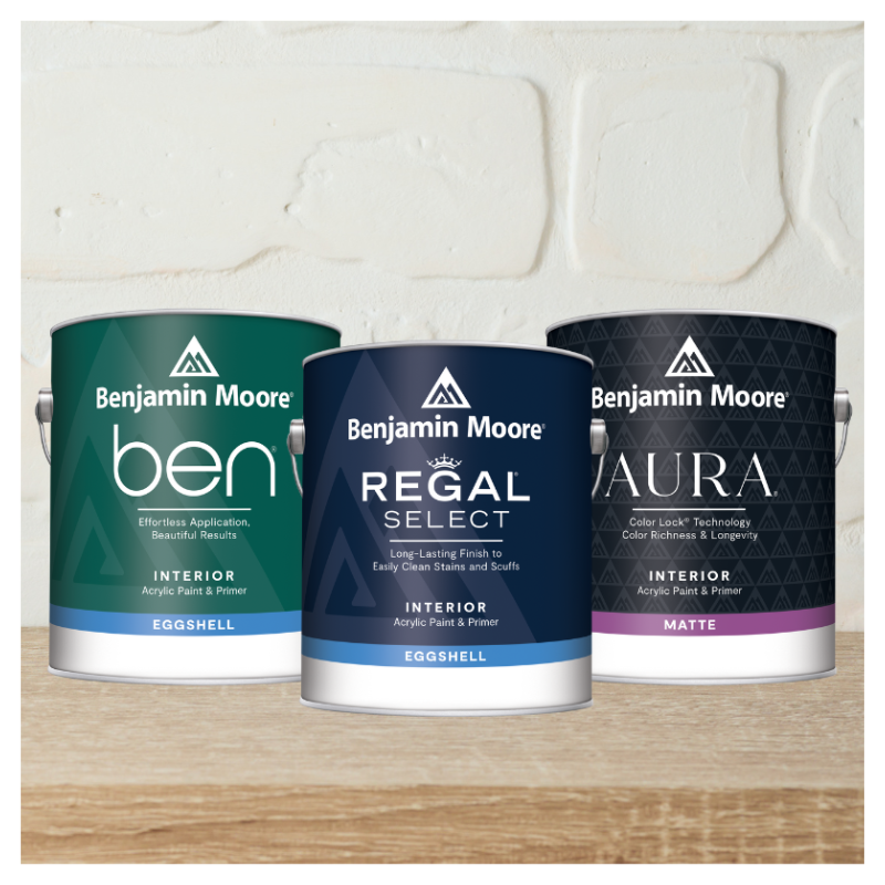
In fact, understanding neutrals may be just the place to start on a journey toward every successful redesign. Here are some of the ways that two designers, Brian Gluckstein and Candice Olson, use the Benjamin Moore neutral shades to showcase what is stunning about their own products as well as the beautiful paint.

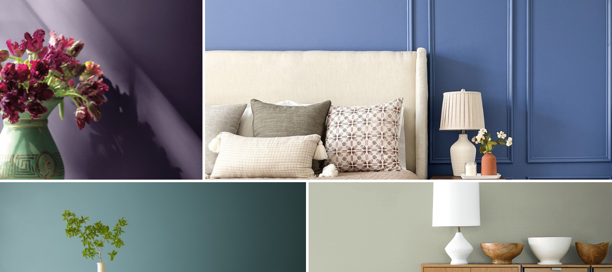
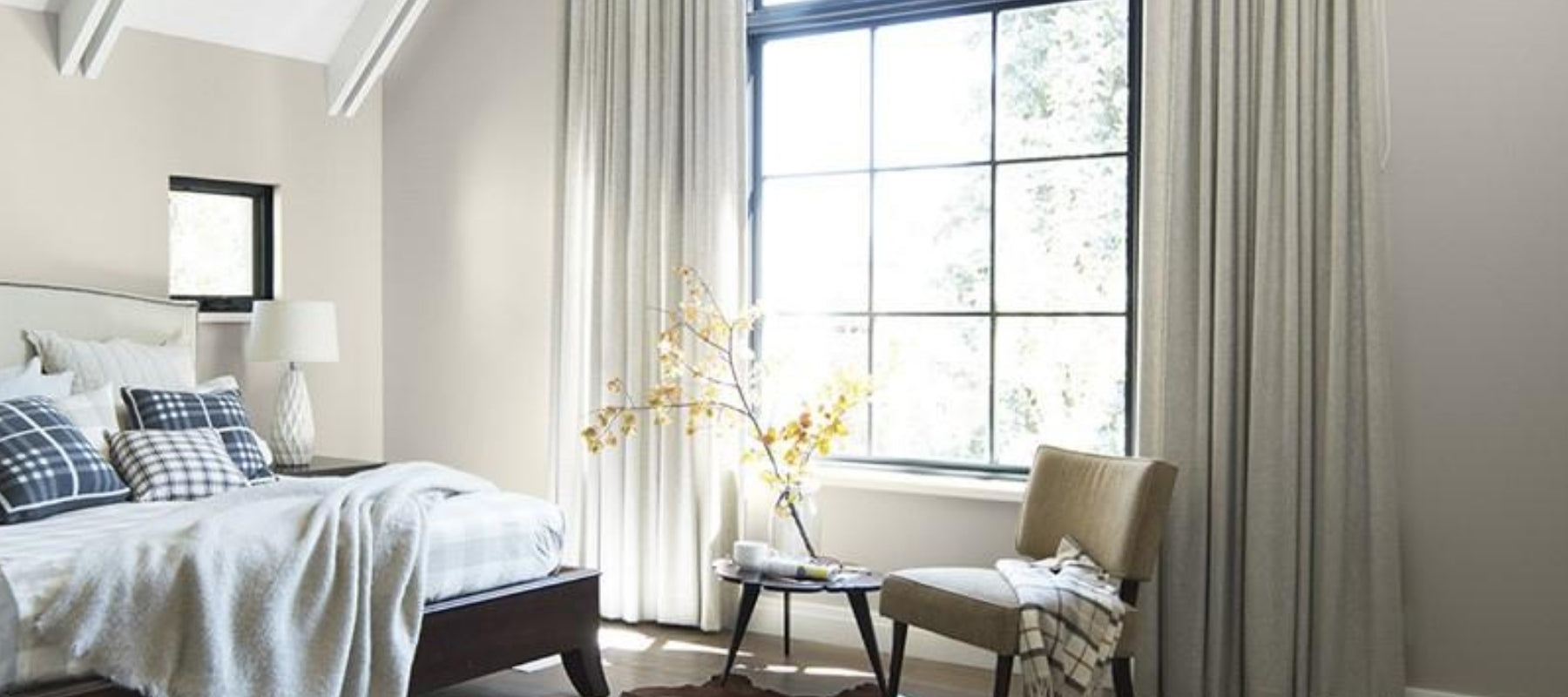
Bedding by Brian
Having an oasis of tranquility for the decor is a frequent go-to for the bedroom design. Brian Gluckstein offers a range of striking and elegant bedspreads, sheets, duvets and more, all ready to match decorating palettes both warm and cool. One bedding collection is calledGrant Bed, which has a perfect blend of neutral shades and recommends the Benjamin Moore colors of Stormy Monday,Kendall CharcoalandPale Oak. The completed look is luxurious!
Candice’s Favorites by Far
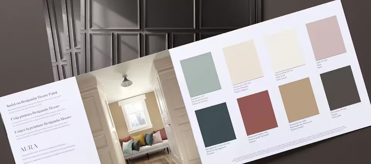
Sometimes, you can’t choose just one favorite color to match your design style. That’s why designer Candice Olson actually has a list of 60 of her favorites, in a wide range that includes many of the neutral shades showcased in the Benjamin Moore color gallery. Some of her favorite neutrals areCedar KeyandAnchor Gray, both of which would bring a lovely accent to any design plan.

Find fresh color inspiration for 2026 with Benjamin Moore’s new Color of the Year and Color Trends Palette. Silhouette is a study in balance — rich yet restrained, moody yet inviting.
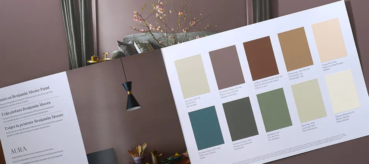

Every year, paint enthusiasts and interior designers eagerly await the announcement of Benjamin Moore’s Color of the Year, a paint trend forecast that sparks excitement and debate. Whether people are quick to embrace the color or need time to warm up to it, the influence on paint and design trends is undeniable. For 2025, Benjamin Moore introduces Cinnamon Slate (2113-40), a color that’s set to redefine how we approach interior paint choices.