Your Cart is Empty
Order for In-store Pickup or Local Delivery

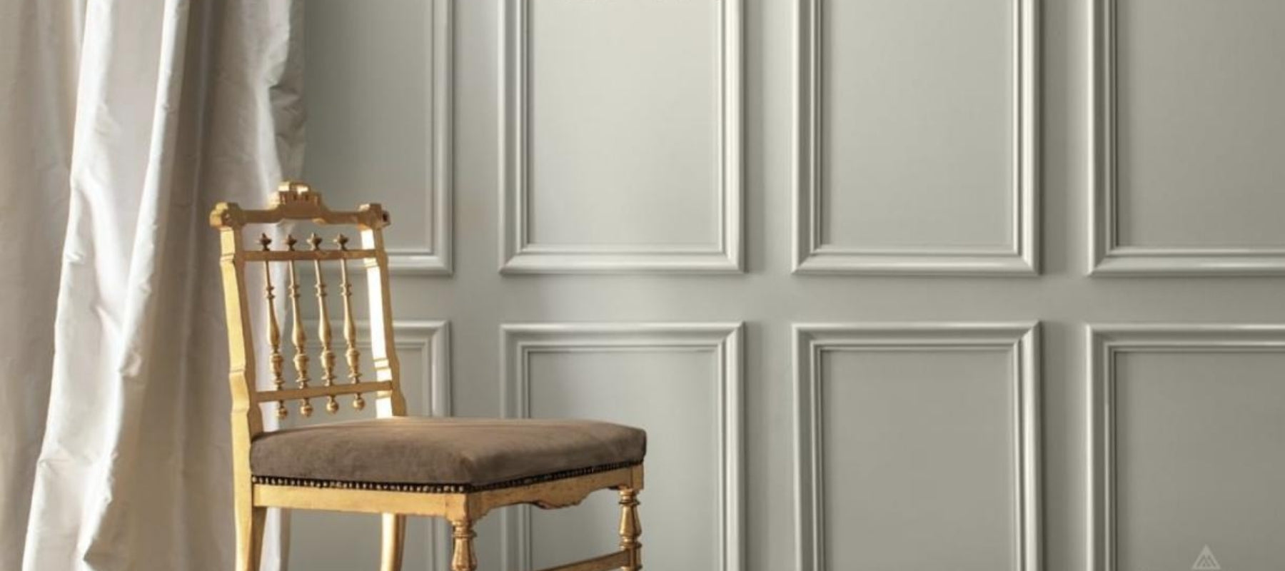
We’ve been fangirling (and fanboying) all over Metropolitan AF-690, Benjamin Moore’s 2019 Color of the Year, but now it’s time to get down to brass tacks: using this phenomenal neutral in your home.

The understated Metropolitan lives to bring out the best in all the elements around it. Think cozy layers of gray to help a modern home find its softer side. Think fresh linens. Think reflective metallic accents. It can bring restorative quiet to a sleek kitchen or serenity against a bold backdrop. With its cool undertones, this sophisticated gray-blue babe becomes a total knockout when you accentuate the positive with light blue accessories, from pillows and lampshades to throw rugs and drapery.
Able to soften to matte or shimmer with sheen, Metropolitan holds the power to change appearance depending on the light exposure (must we dredge up that great blue/black or white/gold dress debate of 2015?). For example, it can actually take on an earthier, almost greenish personality on a south-facing wall bathed in warm sunlight. On a north-facing wall, you might see nuanced violet qualities emerge.

Of course, this chameleon-like trait is not unique to Metropolitan, as many interior paint colors tend to change with the angle and amount of sunlight throughout the day. When choosing a palette, remember:

While we totally get how much Metropolitan AF-690 begs to be painted in a bedroom, kitchen or dining room, we highly recommend taking home a sample to get better acquainted and see how it reacts in different locations and under different light. But by all means, do give it a try and discover all the ways this silver belle can transform a room from good to great.


For 50 years, Benjamin Moore's Historical Color Collection has brought the character of 18th- and 19th-century design into modern homes. From the quiet confidence of Stonington Gray to the bold statement of Heritage Red, these are the shades that never go out of style. Take a look back at where the collection began, and discover the ten colors still shaping homes today.
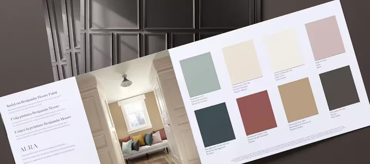

Find fresh color inspiration for 2026 with Benjamin Moore’s new Color of the Year and Color Trends Palette. Silhouette is a study in balance — rich yet restrained, moody yet inviting.
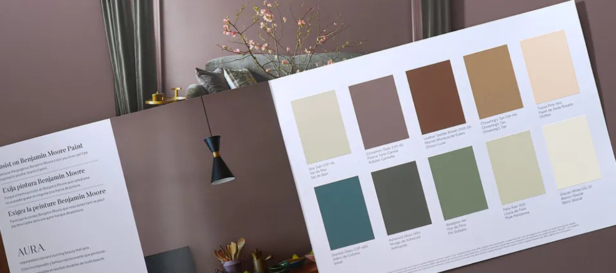

Every year, paint enthusiasts and interior designers eagerly await the announcement of Benjamin Moore’s Color of the Year, a paint trend forecast that sparks excitement and debate. Whether people are quick to embrace the color or need time to warm up to it, the influence on paint and design trends is undeniable. For 2025, Benjamin Moore introduces Cinnamon Slate (2113-40), a color that’s set to redefine how we approach interior paint choices.