Your Cart is Empty
Order for In-store Pickup or Local Delivery

There are bad accents (like Michigan-born Madonna’s habit of periodically dropping a few posh beats of Queen’s English into her Midwestern parlance) and then there are really great accents – the kind that do wonders by creating drama and dimension in a room.
By drawing in the eye, an accent or feature wall heightens visual interest and importance to a space. Applying color and texture to a single wall can give the illusion of a larger room or create an appealing sense of architectural structure without resorting to any kind of construction.

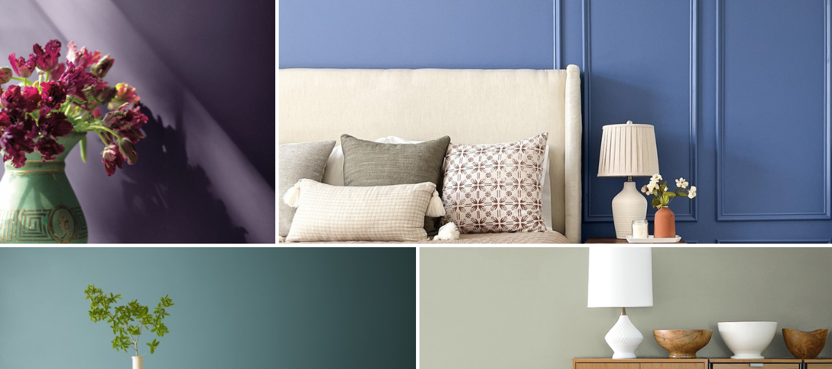
(Benjamin Moore's Knoxville Gray HC-160)
Choosing the best accent wall

(Benjamin Moore's Newburyport Blue HC-155)
Creating a focal point with color and texture
The easiest way to create a focal point is to make the wall a different color from the others in the room. But wait, before you pick up a paint brush – here’s a few things to consider:
What color are on the neighboring walls? It’s not a hard and fast rule, but some of the best accent walls appear to be when the adjoining walls stay in the same color family, just a few shades lighter or darker. Analogous colors (those appearing side by side on the color wheel, e.g. green and yellow) have similar hues and also work well together.
Prefer something a bit stronger? Lovers of ravishing reds and other bold colors, rejoice! Primary colors (red, blue, yellow) and complementary colors (green, purple, orange) definitely have a place as accents; try matching them with more muted tones of primary or complementary colors. Think a silvery blue-grey room featuring a deep navy blue accent wall. Wow!
What works best with a white palette? If the room is a blank slate, it’s tempting to think that any ol’ color will work, but in reality, a strong accent choice in a white room can make it look stark. You want the color to pop, not ka-pow! To soften the contrast, seek out slightly toned-down accent colors for fabrics and accessories that will help bridge the color gap and balance the look.
Why stop at choosing a color? An accent wall is the perfect place to experiment with alluring textural elements. Specialty finishes – chalk paint, brushed suede paint and even flecks of sparkle can take any feature to star-attraction level.
What about a wallpaper accent? As much as we LOVE paint, we also adore wallpaper for making a bold statement: raised textures, edgy patterns, vibrant prints, shiny metallics, and much more. Another upside to limiting a punchy wallpaper to one wall is that it allows you to use a bold pattern that might be a tad too much if used to paper an entire space. And while we’re talking paper, consider a larger-than-life wall mural that will check off all the boxes for color, depth and texture.

Once your feature wall is finished, you’re ready to design the rest of the room. We suggest carrying the accent color throughout the space with decorative touches – a gorgeous area rug, cozy throw pillows, lush draperies or pretty lamp shades. As for the wall itself, curate your favorite framed photos or gleaming accents to punctuate the color and texture; edit wisely as a cluttered accent wall will look disorganized and disrupt the visual flow you want to achieve.
Great job! Now stand back and let that gorgeous accent wall stand out.

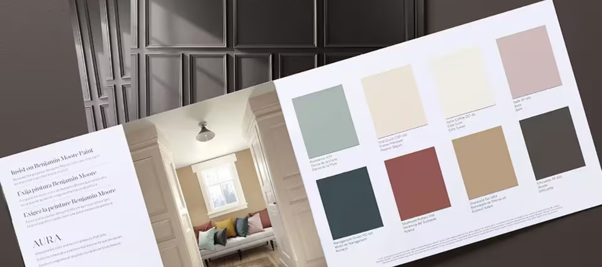
Find fresh color inspiration for 2026 with Benjamin Moore’s new Color of the Year and Color Trends Palette. Silhouette is a study in balance — rich yet restrained, moody yet inviting.

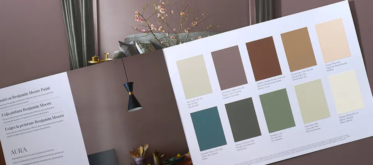
Every year, paint enthusiasts and interior designers eagerly await the announcement of Benjamin Moore’s Color of the Year, a paint trend forecast that sparks excitement and debate. Whether people are quick to embrace the color or need time to warm up to it, the influence on paint and design trends is undeniable. For 2025, Benjamin Moore introduces Cinnamon Slate (2113-40), a color that’s set to redefine how we approach interior paint choices.
